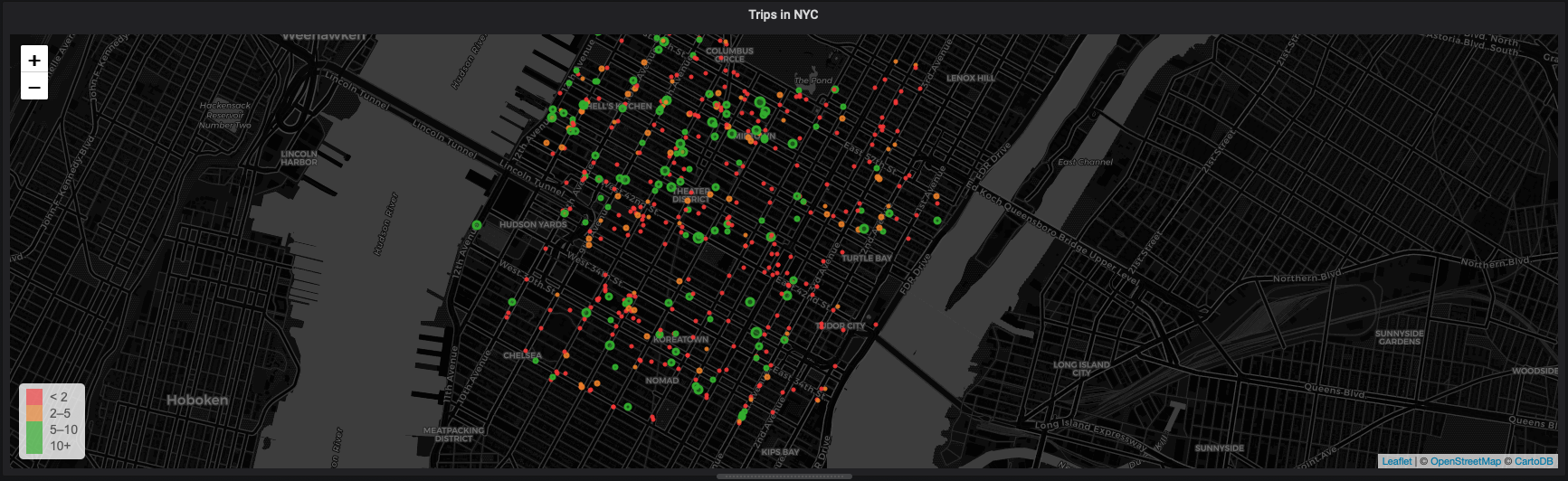
Grafana includes a WorldMap visualization so you can see geospatial data overlaid on a map. This can be helpful to understand how data changes based on its location.
This section visualizes taxi rides in Manhattan, where the distance traveled was greater than 5 miles. It uses the same query as the NYC Taxi Cab tutorial as a starting point.
In your Grafana dashboard, create a new panel, select
New Visualization, and selectWorldmap Panel.Navigate to the
Queriestab.Select your data source.
In the
Format asdropdown, selectTable. ClickEdit SQLand enter the query you want to use. This examples uses this query:SELECT time_bucket('5m', rides.pickup_datetime) AS time,rides.trip_distance AS value,rides.pickup_latitude AS latitude,rides.pickup_longitude AS longitudeFROM ridesWHERE $__timeFilter(rides.pickup_datetime) ANDST_Distance(pickup_geom,ST_Transform(ST_SetSRID(ST_MakePoint(-73.9851,40.7589),4326),2163)) < 2000GROUP BY time,rides.trip_distance,rides.pickup_latitude,rides.pickup_longitudeORDER BY timeLIMIT 500;Configure the visualization by navigating to the
Visualizationtab. Make sure theMap Data Optionsare set totableandcurrent.In the
Field Mappingssection, set theTable Query FormattoTable.Map the
Latitude Fieldto thelatitudevariable, theLongitude Fieldto thelongitudevariable, and theMetricfield to thevaluevariable.In the
Map Visual Optionssection, set theMin Circle Sizeto1, and theMax Circle Sizeto5.In the
Threshold Optionssection, set theThresholdsto2,5,10. This automatically configures a set of colors, which you can adjust later.
Keywords
Found an issue on this page?Report an issue or Edit this page in GitHub.