When you have your dataset loaded, you can create some continuous aggregates, and start constructing queries to discover what your data tells you. This tutorial uses Timescale hyperfunctions to construct queries that are not possible in standard PostgreSQL.
In this section, you learn how to write queries that answer these questions:
- Is there any connection between the number of transactions and the transaction fees?
- Does the transaction volume affect the BTC-USD rate?
- Do more transactions in a block mean the block is more expensive to mine?
- What percentage of the average miner's revenue comes from fees compared to block rewards?
- How does block weight affect miner fees?
- What's the average miner revenue per block?
You can use continuous aggregates to simplify and speed up your
queries. For this tutorial, you need three continuous aggregates, focusing on
three aspects of the dataset: Bitcoin transactions, blocks, and coinbase
transactions. In each continuous aggregate definition, the time_bucket()
function controls how large the time buckets are. The examples all use 1-hour
time buckets.
Connect to the Timescale database that contains the Bitcoin dataset.
At the psql prompt, create a continuous aggregate called
one_hour_transactions. This view holds aggregated data about each hour of transactions:CREATE MATERIALIZED VIEW one_hour_transactionsWITH (timescaledb.continuous) ASSELECT time_bucket('1 hour', time) AS bucket,count(*) AS tx_count,sum(fee) AS total_fee_sat,sum(fee_usd) AS total_fee_usd,stats_agg(fee) AS stats_fee_sat,avg(size) AS avg_tx_size,avg(weight) AS avg_tx_weight,count(CASEWHEN (fee > output_total) THEN hashELSE NULLEND) AS high_fee_countFROM transactionsWHERE (is_coinbase IS NOT TRUE)GROUP BY bucket;Add a refresh policy to keep the continuous aggregate up-to-date:
SELECT add_continuous_aggregate_policy('one_hour_transactions',start_offset => INTERVAL '3 hours',end_offset => INTERVAL '1 hour',schedule_interval => INTERVAL '1 hour');Create a continuous aggregate called
one_hour_blocks. This view holds aggregated data about all the blocks that were mined each hour:CREATE MATERIALIZED VIEW one_hour_blocksWITH (timescaledb.continuous) ASSELECT time_bucket('1 hour', time) AS bucket,block_id,count(*) AS tx_count,sum(fee) AS block_fee_sat,sum(fee_usd) AS block_fee_usd,stats_agg(fee) AS stats_tx_fee_sat,avg(size) AS avg_tx_size,avg(weight) AS avg_tx_weight,sum(size) AS block_size,sum(weight) AS block_weight,max(size) AS max_tx_size,max(weight) AS max_tx_weight,min(size) AS min_tx_size,min(weight) AS min_tx_weightFROM transactionsWHERE is_coinbase IS NOT TRUEGROUP BY bucket, block_id;Add a refresh policy to keep the continuous aggregate up-to-date:
SELECT add_continuous_aggregate_policy('one_hour_blocks',start_offset => INTERVAL '3 hours',end_offset => INTERVAL '1 hour',schedule_interval => INTERVAL '1 hour');Create a continuous aggregate called
one_hour_coinbase. This view holds aggregated data about all the transactions that miners received as rewards each hour:CREATE MATERIALIZED VIEW one_hour_coinbaseWITH (timescaledb.continuous) ASSELECT time_bucket('1 hour', time) AS bucket,count(*) AS tx_count,stats_agg(output_total, output_total_usd) AS stats_miner_revenue,min(output_total) AS min_miner_revenue,max(output_total) AS max_miner_revenueFROM transactionsWHERE is_coinbase IS TRUEGROUP BY bucket;Add a refresh policy to keep the continuous aggregate up-to-date:
SELECT add_continuous_aggregate_policy('one_hour_coinbase',start_offset => INTERVAL '3 hours',end_offset => INTERVAL '1 hour',schedule_interval => INTERVAL '1 hour');
Transaction fees are a major concern for blockchain users. If a blockchain is too expensive, you might not want to use it. This query shows you whether there's any correlation between the number of Bitcoin transactions and the fees. The time range for this analysis is the last 2 days.
If you choose to visualize the query in Grafana, you can see the average transaction volume and the average fee per transaction, over time. These trends might help you decide whether to submit a transaction now or wait a few days for fees to decrease.
Connect to the Timescale database that contains the Bitcoin dataset.
At the psql prompt, use this query to average transaction volume and the fees from the
one_hour_transactionscontinuous aggregate:SELECTbucket AS "time",tx_count as "tx volume",average(stats_fee_sat) as feesFROM one_hour_transactionsWHERE bucket > NOW() - INTERVAL '2 days'ORDER BY 1;The data you get back looks a bit like this:
time | tx volume | fees------------------------+-----------+--------------------2023-06-13 08:00:00+00 | 20063 | 7075.6824502816132023-06-13 09:00:00+00 | 16984 | 7302.617169100332023-06-13 10:00:00+00 | 15856 | 9682.0864026236122023-06-13 11:00:00+00 | 24967 | 5631.9925501662192023-06-13 12:00:00+00 | 8575 | 17594.24256559767...OptionalTo visualize this in Grafana, create a new panel, select the Bitcoin dataset as your data source, and type the query from the previous step. In the
Format assection, selectTime series.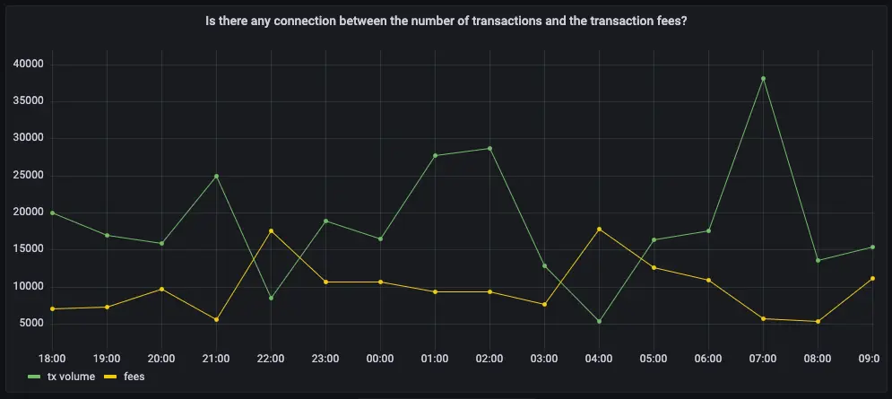
In cryptocurrency trading, there's a lot of speculation. You can adopt a data-based trading strategy by looking at correlations between blockchain metrics, such as transaction volume and the current exchange rate between Bitcoin and US Dollars.
If you choose to visualize the query in Grafana, you can see the average transaction volume, along with the BTC to US Dollar conversion rate.
Connect to the Timescale database that contains the Bitcoin dataset.
At the psql prompt, use this query to return the trading volume and the BTC to US Dollar exchange rate:
SELECTbucket AS "time",tx_count as "tx volume",total_fee_usd / (total_fee_sat*0.00000001) AS "btc-usd rate"FROM one_hour_transactionsWHERE bucket > NOW() - INTERVAL '2 days'ORDER BY 1;The data you get back looks a bit like this:
time | tx volume | btc-usd rate------------------------+-----------+--------------------2023-06-13 08:00:00+00 | 20063 | 25975.8885879314262023-06-13 09:00:00+00 | 16984 | 25976.004463521262023-06-13 10:00:00+00 | 15856 | 25975.9885870145842023-06-13 11:00:00+00 | 24967 | 25975.891667879362023-06-13 12:00:00+00 | 8575 | 25976.004209699528...OptionalTo visualize this in Grafana, create a new panel, select the Bitcoin dataset as your data source, and type the query from the previous step. In the
Format assection, selectTime series.OptionalTo make this visualization more useful, add an override to put the fees on a different Y-axis. In the options panel, add an override for the
btc-usd ratefield forAxis > Placementand chooseRight.
The number of transactions in a block can influence the overall block mining fee. For this analysis, a larger time frame is required, so increase the analyzed time range to 5 days.
If you choose to visualize the query in Grafana, you can see that the more transactions in a block, the higher the mining fee becomes.
Connect to the Timescale database that contains the Bitcoin dataset.
At the psql prompt, use this query to return the number of transactions in a block, compared to the mining fee:
SELECTbucket as "time",avg(tx_count) AS transactions,avg(block_fee_sat)*0.00000001 AS "mining fee"FROM one_hour_blocksWHERE bucket > now() - INTERVAL '5 day'GROUP BY bucketORDER BY 1;The data you get back looks a bit like this:
time | transactions | mining fee------------------------+-----------------------+------------------------2023-06-10 08:00:00+00 | 2322.2500000000000000 | 0.292214187500000000002023-06-10 09:00:00+00 | 3305.0000000000000000 | 0.505126496666666666672023-06-10 10:00:00+00 | 3011.7500000000000000 | 0.447832557500000000002023-06-10 11:00:00+00 | 2874.7500000000000000 | 0.393030095000000000002023-06-10 12:00:00+00 | 2339.5714285714285714 | 0.25590717142857142857...OptionalTo visualize this in Grafana, create a new panel, select the Bitcoin dataset as your data source, and type the query from the previous step. In the
Format assection, selectTime series.OptionalTo make this visualization more useful, add an override to put the fees on a different Y-axis. In the options panel, add an override for the
mining feefield forAxis > Placementand chooseRight.
You can extend this analysis to find if there is the same correlation between block weight and mining fee. More transactions should increase the block weight, and boost the miner fee as well.
If you choose to visualize the query in Grafana, you can see the same kind of high correlation between block weight and mining fee. The relationship weakens when the block weight gets close to its maximum value, which is 4 million weight units, in which case it's impossible for a block to include more transactions.
Connect to the Timescale database that contains the Bitcoin dataset.
At the psql prompt, use this query to return the block weight, compared to the mining fee:
SELECTbucket as "time",avg(block_weight) as "block weight",avg(block_fee_sat*0.00000001) as "mining fee"FROM one_hour_blocksWHERE bucket > now() - INTERVAL '5 day'group by bucketORDER BY 1;The data you get back looks a bit like this:
time | block weight | mining fee------------------------+----------------------+------------------------2023-06-10 08:00:00+00 | 3992809.250000000000 | 0.292214187500000000002023-06-10 09:00:00+00 | 3991766.333333333333 | 0.505126496666666666672023-06-10 10:00:00+00 | 3992918.250000000000 | 0.447832557500000000002023-06-10 11:00:00+00 | 3991873.000000000000 | 0.393030095000000000002023-06-10 12:00:00+00 | 3992934.000000000000 | 0.25590717142857142857...OptionalTo visualize this in Grafana, create a new panel, select the Bitcoin dataset as your data source, and type the query from the previous step. In the
Format assection, selectTime series.OptionalTo make this visualization more useful, add an override to put the fees on a different Y-axis. In the options panel, add an override for the
mining feefield forAxis > Placementand chooseRight.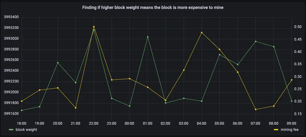
In the previous queries, you saw that mining fees are higher when block weights and transaction volumes are higher. This query analyzes the data from a different perspective. Miner revenue is not only made up of miner fees, it also includes block rewards for mining a new block. This reward is currently 6.25 BTC, and it gets halved every four years. This query looks at how much of a miner's revenue comes from fees, compares to block rewards.
If you choose to visualize the query in Grafana, you can see that most miner revenue actually comes from block rewards. Fees never account for more than a few percentage points of overall revenue.
Connect to the Timescale database that contains the Bitcoin dataset.
At the psql prompt, use this query to return coinbase transactions, along with the block fees and rewards:
WITH coinbase AS (SELECT block_id, output_total AS coinbase_tx FROM transactionsWHERE is_coinbase IS TRUE and time > NOW() - INTERVAL '5 days')SELECTbucket as "time",avg(block_fee_sat)*0.00000001 AS "fees",FIRST((c.coinbase_tx - block_fee_sat), bucket)*0.00000001 AS "reward"FROM one_hour_blocks bINNER JOIN coinbase c ON c.block_id = b.block_idGROUP BY bucketORDER BY 1;The data you get back looks a bit like this:
time | fees | reward------------------------+------------------------+------------2023-06-10 08:00:00+00 | 0.28247062857142857143 | 6.250000002023-06-10 09:00:00+00 | 0.50512649666666666667 | 6.250000002023-06-10 10:00:00+00 | 0.44783255750000000000 | 6.250000002023-06-10 11:00:00+00 | 0.39303009500000000000 | 6.250000002023-06-10 12:00:00+00 | 0.25590717142857142857 | 6.25000000...OptionalTo visualize this in Grafana, create a new panel, select the Bitcoin dataset as your data source, and type the query from the previous step. In the
Format assection, selectTime series.OptionalTo make this visualization more useful, stack the series to 100%. In the options panel, in the
Graph stylessection, forStack seriesselect100%.
You've already found that more transactions in a block mean it's more expensive to mine. In this query, you ask if the same is true for block weights? The more transactions a block has, the larger its weight, so the block weight and mining fee should be tightly correlated. This query uses a 12-hour moving average to calculate the block weight and block mining fee over time.
If you choose to visualize the query in Grafana, you can see that the block weight and block mining fee are tightly connected. In practice, you can also see the four million weight units size limit. This means that there's still room to grow for individual blocks, and they could include even more transactions.
Connect to the Timescale database that contains the Bitcoin dataset.
At the psql prompt, use this query to return block weight, along with the block fees and rewards:
WITH stats AS (SELECTbucket,stats_agg(block_weight, block_fee_sat) AS block_statsFROM one_hour_blocksWHERE bucket > NOW() - INTERVAL '5 days'GROUP BY bucket)SELECTbucket as "time",average_y(rolling(block_stats) OVER (ORDER BY bucket RANGE '12 hours' PRECEDING)) AS "block weight",average_x(rolling(block_stats) OVER (ORDER BY bucket RANGE '12 hours' PRECEDING))*0.00000001 AS "mining fee"FROM statsORDER BY 1;The data you get back looks a bit like this:
time | block weight | mining fee------------------------+--------------------+---------------------2023-06-10 09:00:00+00 | 3991766.3333333335 | 0.50512649666666662023-06-10 10:00:00+00 | 3992424.5714285714 | 0.472387102857142862023-06-10 11:00:00+00 | 3992224 | 0.443530009090909062023-06-10 12:00:00+00 | 3992500.111111111 | 0.370565572222222252023-06-10 13:00:00+00 | 3992446.65 | 0.39728022799999996...OptionalTo visualize this in Grafana, create a new panel, select the Bitcoin dataset as your data source, and type the query from the previous step. In the
Format assection, selectTime series.OptionalTo make this visualization more useful, add an override to put the fees on a different Y-axis. In the options panel, add an override for the
mining feefield forAxis > Placementand chooseRight.
In this final query, you analyze how much revenue miners actually generate by mining a new block on the blockchain, including fees and block rewards. To make the analysis more interesting, add the Bitcoin to US Dollar exchange rate, and increase the time range.
Connect to the Timescale database that contains the Bitcoin dataset.
At the psql prompt, use this query to return the average miner revenue per block, with a 12-hour moving average:
SELECTbucket as "time",average_y(rolling(stats_miner_revenue) OVER (ORDER BY bucket RANGE '12 hours' PRECEDING))*0.00000001 AS "revenue in BTC",average_x(rolling(stats_miner_revenue) OVER (ORDER BY bucket RANGE '12 hours' PRECEDING)) AS "revenue in USD"FROM one_hour_coinbaseWHERE bucket > NOW() - INTERVAL '5 days'ORDER BY 1;The data you get back looks a bit like this:
time | revenue in BTC | revenue in USD------------------------+--------------------+--------------------2023-06-09 14:00:00+00 | 6.6732841925 | 176922.11332023-06-09 15:00:00+00 | 6.785046736363636 | 179885.15768181822023-06-09 16:00:00+00 | 6.7252952905 | 178301.027350000022023-06-09 17:00:00+00 | 6.716377454814815 | 178064.59780740742023-06-09 18:00:00+00 | 6.7784206471875 | 179709.487309375...OptionalTo visualize this in Grafana, create a new panel, select the Bitcoin dataset as your data source, and type the query from the previous step. In the
Format assection, selectTime series.OptionalTo make this visualization more useful, add an override to put the US Dollars on a different Y-axis. In the options panel, add an override for the
mining feefield forAxis > Placementand chooseRight.
Keywords
Found an issue on this page?Report an issue or Edit this page in GitHub.